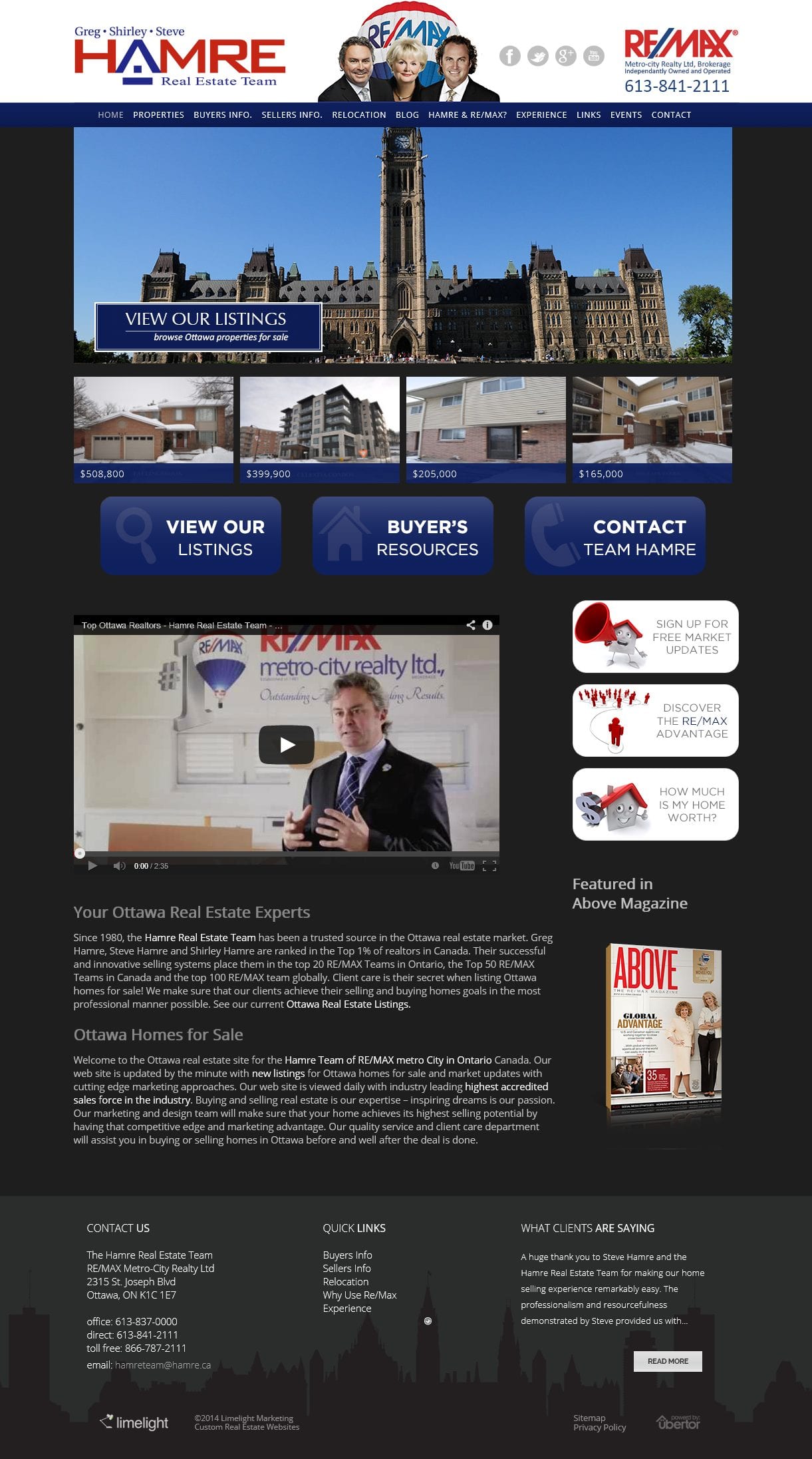
When Steve, Greg and Shirley Hamre contacted us about updating and redesigning their Ubertor website with a new design we were flattered. The Hamre real estate team has invested more time and effort into their website than any other client we have worked with and we were not sure how they would react to the new, clean, easy to navigate, contemporary look we were proposing.
As it turns out there was nothing to worry about. The reaction was great! We analyzed what visitors did when they came to the old website and made sure the new website accommodated their habits. The Javascript banners which display on Apple devices have captions and are clickable to take visitors to the page they want. There are 6 Call to action icons and we have featured four listings on the home page.
Video is a big part of the Hamre marketing program so we feature the most recent video on the home page. Side menus were added on many of the pages to make it easy for visitors to click through different topics. The new website retains the RE/MAX look while still reflecting the Hamre brand.
Hamre Real Estate Team Website
