All Posts By

Mike Blaney

Realtor Personal Infographic

By Branding, Marketing Strategy, Realtor Marketing

Do you have a personal brochure you can provide new clients or give out at open houses? If not, think about a Personal Infographic where you convey almost all of the important information about you on a single page.

In addition to having all of your contact information, it allows you to highlight achievements, give a bit of  personal and professional background about yourself and highlight why people should work with you.

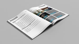
Below is a mock-up of my personal Infographic (the Awards and Achievements are examples only), but for only $99.00* we can create a customized Infographic for you.  Complete the form below to get started.

*Limited time offer.

LAYOUT-CS6a

Ubertor Before and After Update to Responsive

By Uncategorized

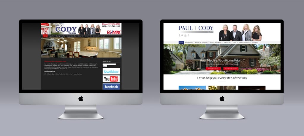
We were asked by the Cody Team to update their Ubertor website to a Responsive design that would render perfectly on iPhones, iPads and other handhelds. They also wanted a true mobile site to improve their search engine results.

As part of the makeover we designed a new logo for the team that was more contemporary.

At the same time we integrated the CREA DDF feed to add more listings to their website and make it more useful to visitors.

Cody-Team-before&after

Cody Team Before and After – Ubertor Responsive

Upgrade of an Ubertor website to a Responsive, wide screen template. Designed by Limelight Marketing.

Ubertor Website Makeover and Update to Responsive – Case Study 1

By Design, Responsive Websites, Ubertor, Website Design

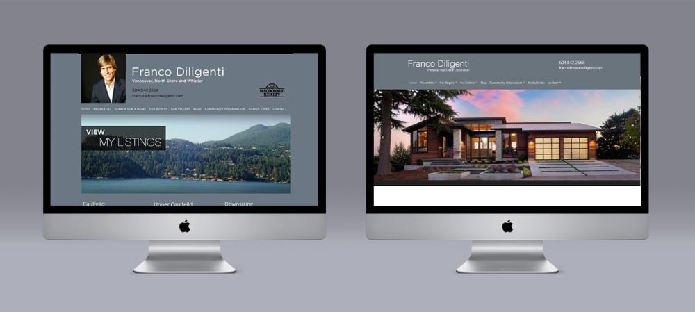
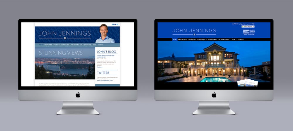
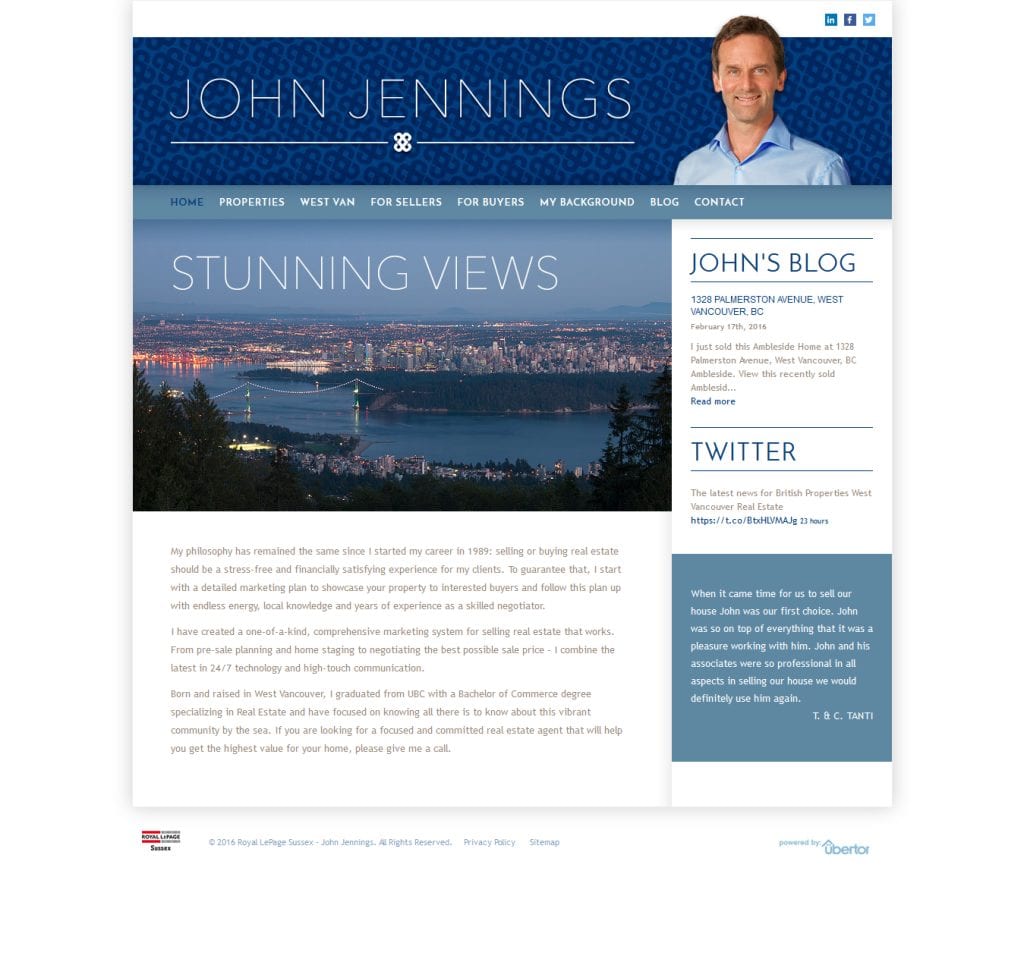
We were selected by West and North Vancouver Realtor® John Jennings to update his Ubertor website to a Responsive design that would render perfectly on iPhones, iPads and other handhelds. He also wanted a true mobile site to improve their search engine results.

On the home page we added images as link to the different areas John markets in. The website also has a testimonial slider on the home page to showcase what his clients are saying. We also reformatted every page to make them all uniform and the Active listings page has cool icons.

John’s website has always been singled out as a good one, so getting the opportunity to update it was a feather in our cap.

BEFORE

John Jennings website before

AFTER

John Jennings Website after

Launch Website

Ubertor Website Makeover and Update to Responsive

By Branding, Mobile Websites, Responsive Websites, Ubertor, Website Design

We were asked by the Cody Team to update their Ubertor website to a Responsive design that would render perfectly on iPhones, iPads and other handhelds. They also wanted a true mobile site to improve their search engine results.

As part of the makeover we designed a new logo for the team that was more contemporary and easier to add to marketing material.

At the same time we integrated the CREA DDF feed to add more listings to their website and make it more useful to visitors. A top menu on each page allows easy clicking from area to area.  On the home page we added an interesting map with mouse over effect to draw attention to the different areas. The website also has a testimonial slider to showcase what their clients are saying. We also reformatted every page to make them all uniform and  the Active listings page has cool icons.


How To Get a Testimonial From a Client

By Marketing Strategy, Realtor Marketing

I think a testimonial from a client is one of the most valuable tools to market yourself. When a prospect is on your website checking you out and comparing you to your competitor they will always read the About Me and at the very least skim through your testimonials to get a sense of what you are all about.

  1. A client testimonial can say things about you that you cannot say about yourself.
  2. A client testimonial can introduce benefits of working with you.
  3. A client testimonial can introduce a different area or service you offer.
  4. A client testimonial can answer the question “Why should I work with ______”

How do you ask for a testimonial?

My advice is to simply ask in person, by phone or email for a referral. If by phone or in person you can record the testimonial and email it back to them for confirmation. Also determine if you can use their full name or if the prefer initials.

When you receive an email from a client praising you for some aspect of your service such as “great job negotiating the final price. You saved us thousands!” Ask if you can use this as part of their testimonial.

Use a testimonial request system

You can set up a Question and Answer using services like Wufo, Mailchimp or Jotform and email your clients a fill in the blank questionnaire.

You can pay for online services using service like Get Five Stars, or if your are a Realtor check out Homethinking.com, AgentScoreboard.com, RealEstateRatingz.com or IncredibleAgents.com

In our case our Freshbooks online invoicing service has an option to request a review when the invoice has been emailed. Our clients like the professional approach and are more likely to provide a testimonial.

In our online world with the proliferation of Social Media your clients have more options than ever. You need to stand out and the best way to do that is to share glowing testimonials on your website, through your social media and on your print media.

Advice on the Logo Creation Process for Realtors

By Branding, Design, Realtor Marketing

Logos

Developing a great logo is a strange mix of art, science, psychology and a good amount of luck. Your logo is not your brand.

  • Your logo only represents your brand.
  • Your logo is a visual mark that represents your brand. It allows people needing the service you provide to find Jen Murphy - Monogram - Colouryou, remember you and differentiate you from a few million other Realtors.
  • While your logo is not your brand, its design and consistent use will affect how your brand will be perceived. A great logo can give you incredible leverage and contribute directly to your bottom line. On the other hand, a lousy one may very well have the opposite effect.

 Designing a logo

• Good logos are designed in black and white first. Colour comes later.
• Good logos have unique shapes that quickly differentiate you. Your name in the right font is a shape and can be a logo.
• The shape must be simple, clean and quick.
• Logos should have staying power. Avoid trendy stuff.
• Is your logo scalable? Will it work on a business card and the back of a bus?
• Pick a colour combination that doesn’t just work today but will maintain its appeal and meaning over time.

When we design logos for Realtors their name is sometimes a part of the logo like the ones below:

CS6-2_Page_04a

The Finchams CS6-2_Page_09

Here are a few examples of stand alone logos we have designed:

Gordon Kleaman - Logo -Hart & Cook logo CS6-2_Page_01

Belinda Parkes logo

Kris Goudreau logo

Marie Hermanson logoDerek Williams logo

From our experience designing a logo is the hardest thing we do as our clients do not know what they want, but they definitely know what they don’t want based on what we design. Many times a logo literally pops out from the combination of the fonts, colour and slogan that we have designed.

Click here to visit our Portfolio of logos and nameplates we have designed.


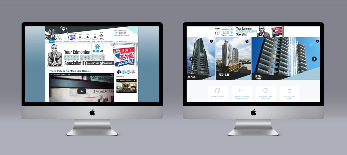
Get Jakie Ubertor Website Before and After

Ubertor Website Makeover and Update For Jakie Ng

By Ubertor, Website Design

Jakie Ng, a Realtor from Edmonton, AB asked Limelight to update his website and draw more attention to the various condo buildings he targets in Edmonton. We added a unique slider that had static, clickable images of the buildings. This banner is wide screen and stretches from side to side. The wider template also allowed us to space out the home page information.

To assist with on page navigation we added 4 Call to Actions buttons under the banner and a footer that is at the bottom of all pages with contact information.

Each building page was formatted with tabs and a sidebar to deliver a lot if information on one page.

Home Staging Case Study

Brochure to Sell Home Staging to Increase Selling Price

By Design, Marketing Strategy, Realtor Marketing

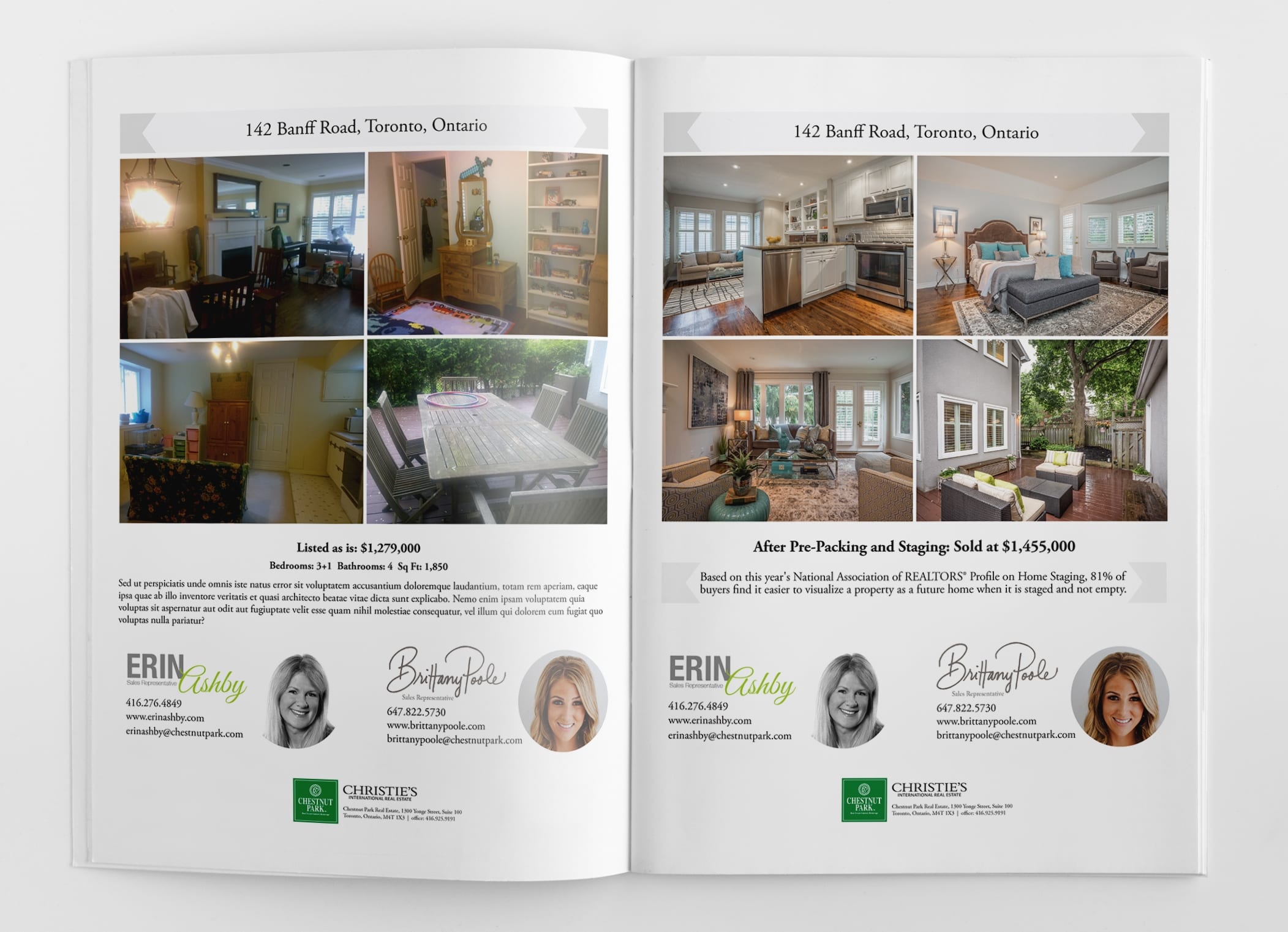
Our Realtor clients asked us to create a brochure to demonstrate the value of home staging to increase the selling price of the home. Our clients invested a significant amount into the project which is typical of their marketing strategy so the brochure would be used to market them too. Their client’s home did not show well and many of the “before” photos were too extreme to use so we had to find a subtle way to convey the improvements.

The original listing price was $1,279,000 and the actual selling price was $1,455,000 so we had to convey this in 2 pages. We created a feature sheet for the “before” home with the lower price and on the 2nd side we created a feature sheet for the “after” home with the higher price.

While we cannot disclose the cost of the staging and improvements the difference in price was an incredible $176,000 which reflect a huge return on the seller’s investment.

We could not use the actual “before” and “after” photos for each room so we tried to simply convey the overall improvement and how well the home showed after.

Marketing for Realtors: How to Create a Listing Presentation

By Realtor Marketing

There are three elements of a listing presentation;

  • The meet and greet
  • The actual presentation
  • The physical material you provide

The Meet and Greet

How important is the time between when you meet the potential client, walk through their home and sit down to present your listing presentation? A 1970 study conducted by Ray Birdwhistell at the University of Pennsylvania concluded 93% of our communication transpires nonverbally and unconsciously. 55% of our communication is our physiology or body language; 38% is tonality or how we say our words; and only 7 percent is the content or words we choose to speak.

So, how do we improve our nonverbal communication style?

According to Cindy Stockhaus, a successful listing agent from Jarvis Realty Group (http://www.jarvisrealtygroup.com) in Indiana, there are four keys to creating a personal connection.

Mirror and match: Match your voice, your cadence of speech and your body language to your client. This will put them at ease and make them feel more connected to you.

Listen: Hear what your client is truly saying and respond accordingly, rather than thinking about what you’re going to say next. People don’t care about how much you know until they know how much you care.

Build commonality: As you have them give you a tour of their home, try to create a common bond by finding shared interests based on decorating style, pictures and passions. (Think sports, travel, kids, fashion, etc.)

Be genuine: Bring yourself to the table. People can tell if you’re faking it … and they want to do business with YOU, not who you think they want to do business with.

After the Meet and Greet and paying close attention to the 4 points above you are ready to sit down to present your listing presentation.

Actual Listing Presentation

The actual Listing Presentation can be broken down into the three Ps of a listing presentation.

Prepare with property knowledge.

Check out the history of the property, recent tax assessment, liens, zoning and if there are any future plans for the area. Know the schools, proximity to transportation and something about the architecture of the home or building.

Prepare with accurate market data.

The more you know about the market the better prepared you are to recommend a listing price and be able to support it. The vendor will probably know what the neighbour’s house sold for and think their home is worth more.

You also need to convey what kind of market they are selling in; a buyer’s market, seller’s market or a flat market. You will need to have data on recent sales in the area, expired and cancelled listings and the average days on market.

Prepare to impress.

Nothing says you are the right Realtor to sell their home like a listing presentation that looks professional. You never know if you are one of a few Realtors they are interviewing and you want to make a strong and lasting impression.

There are all kinds of methods to bind your listing presentation so we won’t go into this in detail, but if you want to be taken seriously by someone selling a million dollar home I would spare no expense on the quality of the paper, making it easy to read and the packaging of your listing presentation.

What should be in your listing presentation?

First thing to remember is what the seller is thinking as you are presenting:

  • How much are you going to sell my house for?
  • When will you sell it?
  • When do I get my money?

If you are using a “canned” presentation from your broker your current listing presentation is 90% about you and 10% about selling the home. Here is a general table of contents that I recommend for a seller-centric listing presentation:

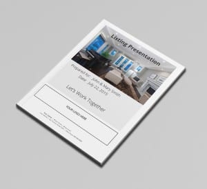
  • Nice looking personalized cover with the vendors name and your contact information
  • One page About Us
  • One page About Our Company (if it is a brand with impact)
  • Comparative Market Analysis – With your comparison listings behind
  • Tax Records and any past MLS Listings for the property
  • Marketing Plan for their home – Calendar of events related to listing and selling their home
  • Commission chart handout (optional)
  • Listing Contract Paperwork
  • Testimonials
  • Preparation For Showing
  • Home Selling Process
  • Frequently Asked Questions – Pose the questions that you want them to read an acknowledge like:
    What can we do to improve the appearance of our house?
    What is home staging and how will it help sell our house?
    Where Do Buyers Come From?

Following are pages that make your listing presentation all about you and you might want to delete some or all from your current listing presentation:

  • Who We Are
  • Our Mission Statement
  • Our Value Statement
  • Our Vision
  • Our Story
  • Our Team
  • What makes us different
  • Our Services
  • Our Pledge
  • Why You Should List With Us
  • What You Should Expect From Us

How will you know if you are on the right track? Your job is to create an environment of trust, respect, and collaboration where your seller feels supported to make the best decision possible and that decision is to sign your listing agreement.

Click here to view a pdf version.

Click here to view our standard layout for a listing presentation.
 

File-SevenPage-6-and-7Page-8-and-9Page-14-and-15