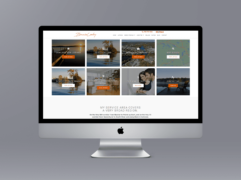
New website design for Muskoka Realtor Bonnie Looby. Uses the WordPress CMS. Mobile-ready & responsive. This is a unique site in that we have replaced the traditional scenic or house banners with 8 Calls To Action.

New website design for Muskoka Realtor Bonnie Looby. Uses the WordPress CMS. Mobile-ready & responsive. This is a unique site in that we have replaced the traditional scenic or house banners with 8 Calls To Action.
• Good logos are designed in black and white first. Colour comes later.
• Good logos have unique shapes that quickly differentiate you. Your name in the right font is a shape and can be a logo.
• The shape must be simple, clean and quick.
• Logos should have staying power. Avoid trendy stuff.
• Is your logo scalable? Will it work on a business card and the back of a bus?
• Pick a colour combination that doesn’t just work today but will maintain its appeal and meaning over time.
From our experience designing a logo is the hardest thing we do as our clients do not know what they want, but they definitely know what they don’t want based on what we design. Many times a logo literally pops out from the combination of the fonts, colour and slogan that we have designed.
If you hire a freelance designer through an online service or a local company expect to get what you paid for.
You can learn more bu visiting our logo page by clicking here.

It’s your customer’s first experience, your voice and your badge of honour. It helps customers to remember you and differentiate you from other businesses. Good logos should be clean and unique to potential customers.A company should not only be different, it must be seen as different. Like a musical theme, your brand is the big idea that colours and connects every aspect of communication as well as the cultural identity and appeal of its products, people and services. Given a clear and consistent branding strategy, the value, purpose and energy of a company works in unison for the benefit of all concerned.