Category

Website Design

5 Must-Knows to Boost Your Site Appeal to Chinese From Juwai

By Website Design

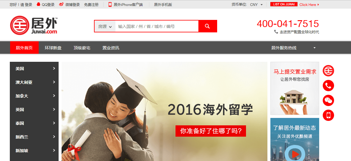
Juwai.com recently published 5 must-knows to boost your site appeal to Chinese.  They say if you’re planning to market to Chinese buyers online understand their expectations, consumption patterns, and cultural backgrounds before incorporating these insights to build your online presence makes all the difference.

Chinese websites vs. Western websites

The first thing to understand is that Chinese websites and Western websites are polar opposites in many aspects. In fact, looking at Chinese e-commerce websites, one would think that most Chinese website designers suffer from horror vacui – a “fear of empty space” in Latin.

The amount of information crammed into a single page could easily be described as cluttered, chaotic, and even claustrophobic to look at, much less navigate. It’s practically an information overload and a baffling disparity for non-Chinese netizens.

This is even more apparent as minimalism is favoured in most advertisings and designs – especially for websites ­– in the West, and probably most parts of the world. After all, it’s commonly perceived that tasteful understatement appeals more to the taste of the affluent.

Not so in China though, where apparently – or at least in terms of websites – less is not always more.

5 Things to Know About Chinese Websites

#1 Language differences

Part of the cluttered feeling stems from the fact that the Chinese language doesn’t have italics or capital letters. This limits opportunities for adding the visual punch that you get with Latin alphabets, making it difficult to create the contrasts required to organise information with type alone.

#2 Minimum time, maximum info dissemination

Time is money, and this rings truer than ever in China. Thanks to the Great Firewall of China, most Chinese internet users are still plagued with slow loading times and limitations when it comes to international sites.

Hence, displaying as much information as possible is vital to retain consumer interest in China, so what may seem to be clutter to you is in fact seen as “content-rich” by Chinese internet users.

#3 Assurance and safety

Chinese consumers require a high degree of assurance – likely fuelled by the amount of fake or low-quality products in China – before making a purchasing decision.

So, while catchy headlines or pretty images are crucial in drawing interest and attention, but it won’t help seal the deal if there is insufficient information to convince Chinese buyers that they’re making a worthy purchase, especially as property is a major financial investment.

#4 Online reflection of China

Fact is, Chinese sites very much mirror China’s urban landscape. Walk around a major city in mainland China, and you may very well be overwhelmed by its bright advertisements, bustling boulevards, expansive choice of retail options, and Chinese shoppers swarming around you.

Websites designers in China aim to recreate this on Chinese websites, ensuring that every spare inch of space gets used up to mimic a boisterous and frenetic bazaar atmosphere.

#5 Digits sometimes play a role

From domain names to emails to social media accounts, numerical digits are a nifty way to catch Chinese attention in China’s cyberspace. Not only are numbers easier for Chinese to remember, but numbers are also homophones or near homophones for certain Chinese words – turning them into quirky and creative wordplays when used alone or combined.

Read the entire article by clicking here.

Upgrade of an Ubertor website to a Responsive, wide screen template. Designed by Limelight Marketing.

Ubertor Website Makeover and Update to Responsive – Case Study 1

By Design, Responsive Websites, Ubertor, Website Design

We were selected by West and North Vancouver Realtor® John Jennings to update his Ubertor website to a Responsive design that would render perfectly on iPhones, iPads and other handhelds. He also wanted a true mobile site to improve their search engine results.

On the home page we added images as link to the different areas John markets in. The website also has a testimonial slider on the home page to showcase what his clients are saying. We also reformatted every page to make them all uniform and the Active listings page has cool icons.

John’s website has always been singled out as a good one, so getting the opportunity to update it was a feather in our cap.

BEFORE

John Jennings website before

AFTER

John Jennings Website after

Launch Website

Ubertor Website Makeover and Update to Responsive

By Branding, Mobile Websites, Responsive Websites, Ubertor, Website Design

We were asked by the Cody Team to update their Ubertor website to a Responsive design that would render perfectly on iPhones, iPads and other handhelds. They also wanted a true mobile site to improve their search engine results.

As part of the makeover we designed a new logo for the team that was more contemporary and easier to add to marketing material.

At the same time we integrated the CREA DDF feed to add more listings to their website and make it more useful to visitors. A top menu on each page allows easy clicking from area to area.  On the home page we added an interesting map with mouse over effect to draw attention to the different areas. The website also has a testimonial slider to showcase what their clients are saying. We also reformatted every page to make them all uniform and  the Active listings page has cool icons.


Get Jakie Ubertor Website Before and After

Ubertor Website Makeover and Update For Jakie Ng

By Ubertor, Website Design

Jakie Ng, a Realtor from Edmonton, AB asked Limelight to update his website and draw more attention to the various condo buildings he targets in Edmonton. We added a unique slider that had static, clickable images of the buildings. This banner is wide screen and stretches from side to side. The wider template also allowed us to space out the home page information.

To assist with on page navigation we added 4 Call to Actions buttons under the banner and a footer that is at the bottom of all pages with contact information.

Each building page was formatted with tabs and a sidebar to deliver a lot if information on one page.

Responsive Websites for Realtors

By Mobile Websites, Responsive Websites, Website Design, Wordpress

On April 21, 2015 Google went public with a change to their algorithm that sent website users into a panic. As of this date it was reported mobile-friendly websites would rank better than non-mobile optimized websites.

According to MOZ a leading source of Google algorithm information “In a rare move, Google pre-announced an algorithm update, telling us that mobile rankings would differ for mobile-friendly sites starting on April 21st. The impact of this update was, in the short-term, much smaller than expected, and our data showed that algorithm flux peaked on April 22nd.”

Regardless, Realtor websites are viewed more often on mobile devices than many industries so a responsive design that renders perfectly on iPads, iPhones and other hand held devices will give a Realtor an advantage.

Since that date Limelight Marketing exclusively designs and publishes Responsive designs using the Ubertor CMS.

New Website for Picton, ON Area Realtor Gail Forcht

By Branding, Marketing Strategy, Realtor Marketing, Responsive Websites, Ubertor, Website Design

Gail Forcht a Realtor in Picton, ON asked us to design a website that reflected the unique nature of the Prince Edward County area. The Responsive website opens with a great lake shot, call to action buttons with local photos and a slide show of the area. Uses the Ubertor CMS.

Added mouse over images to help lead people to their listing. Added a slide show with images of the area and optimized it for search engines. We forwarded her original domain Gail Forcht to a more appropriate url – www.propertyforsaleprinceedwardcounty.com


Read More